


2026 | Brand Identity | Website Design | UI/UX
LUMA
Youth mental health platform - Concept
PROJECT
Mental health support for young people often feels clinical, distant, or inaccessible.
Existing platforms prioritise structure over emotional connection, making it difficult for users to engage in moments of vulnerability.
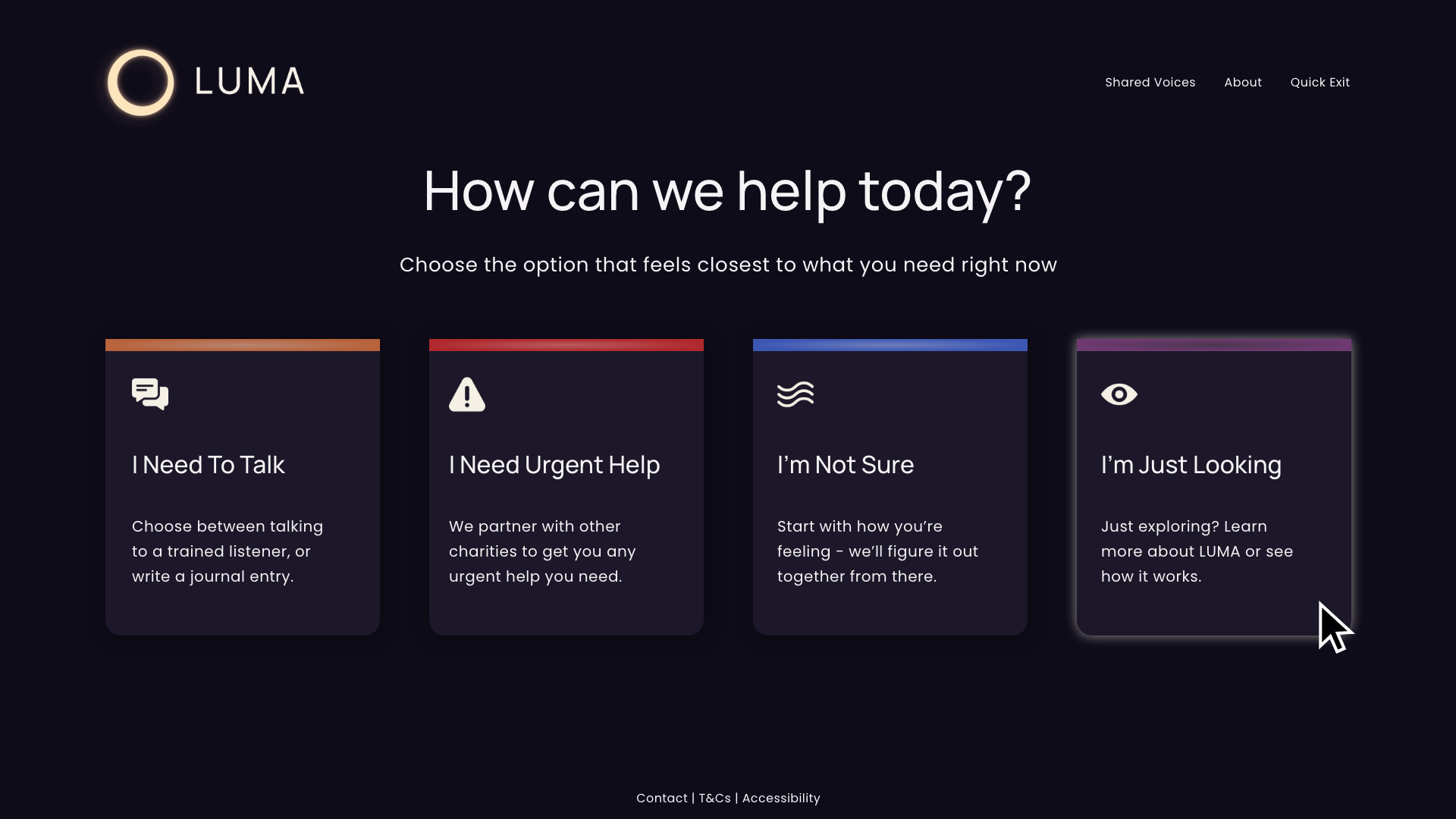
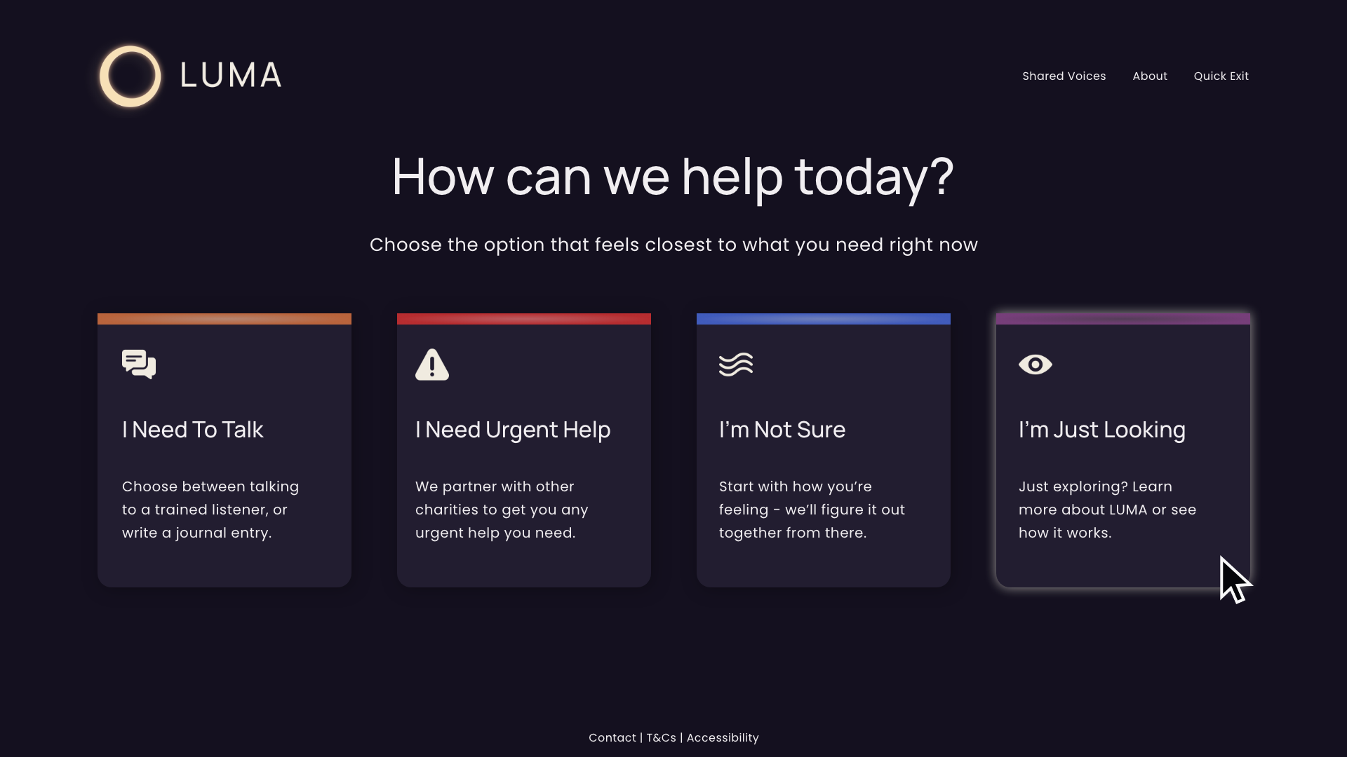
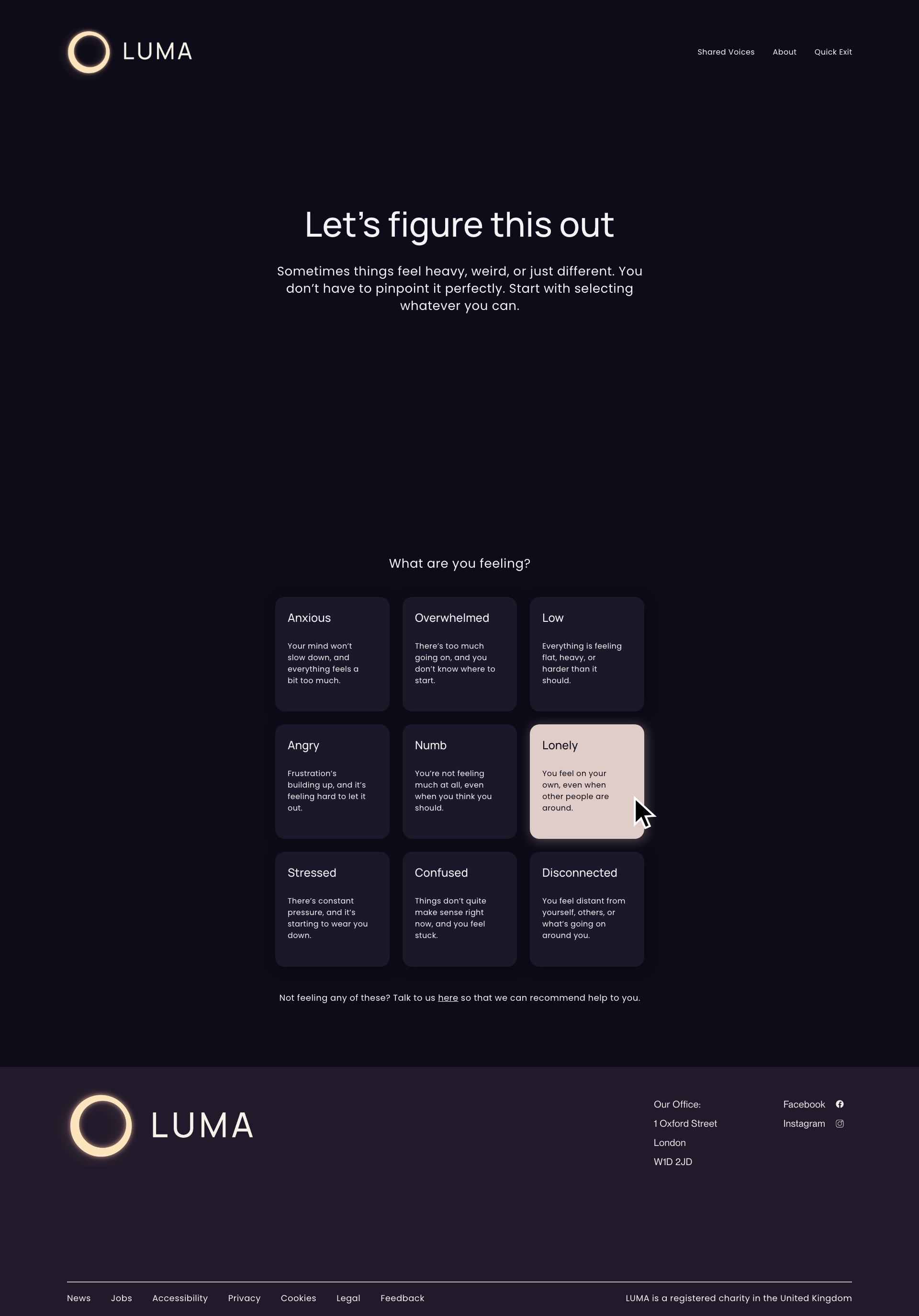
LUMA was designed to create a more immediate, human entry point into support - removing friction, reducing intimidation, and focusing on how people feel first.
Designed for how people feel, not what they click
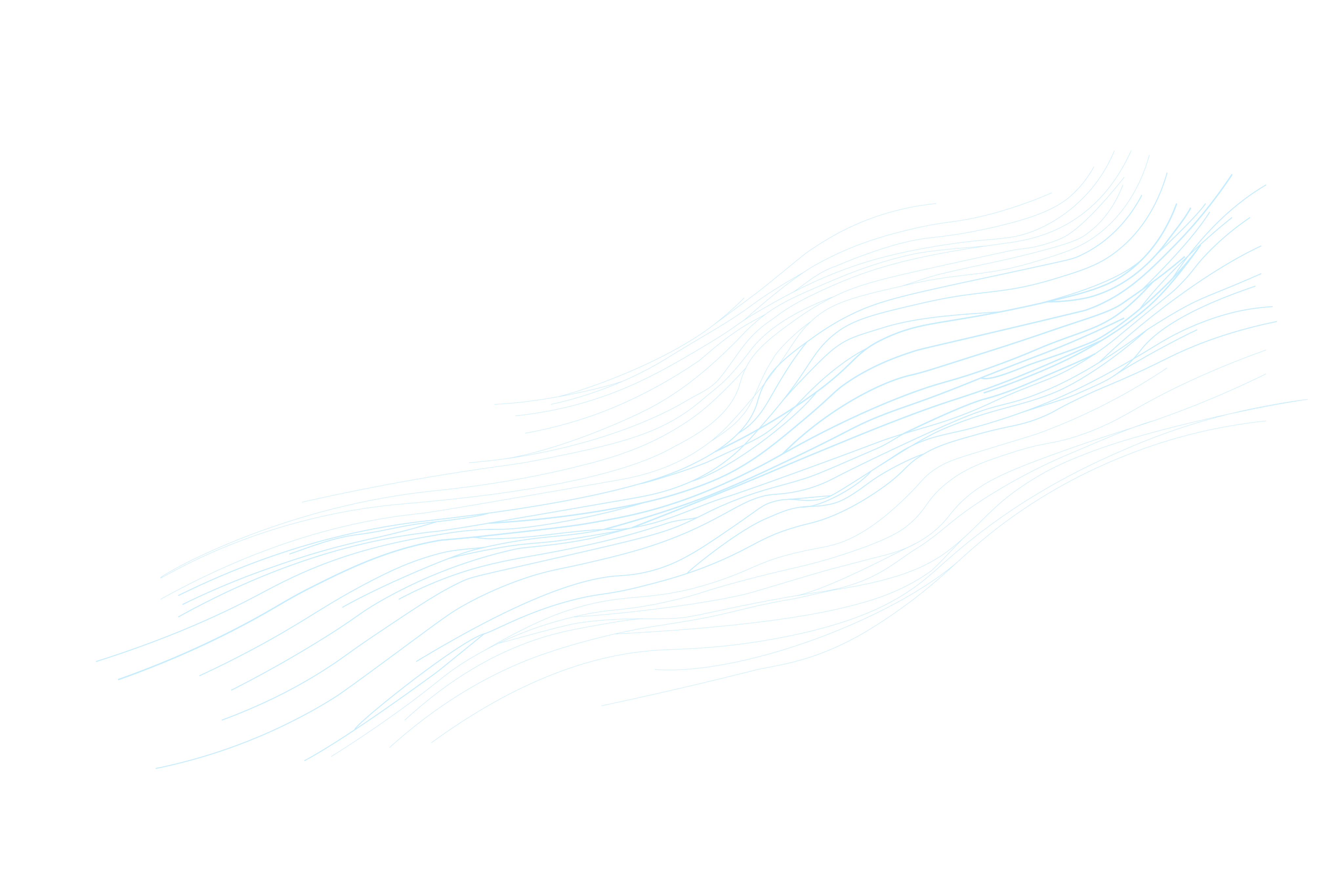
A calm, recognisable visual language
Outcome
Built around clarity, safety, and accessibility
LUMA shifts away from clinical, task-based systems toward emotion-led interaction.
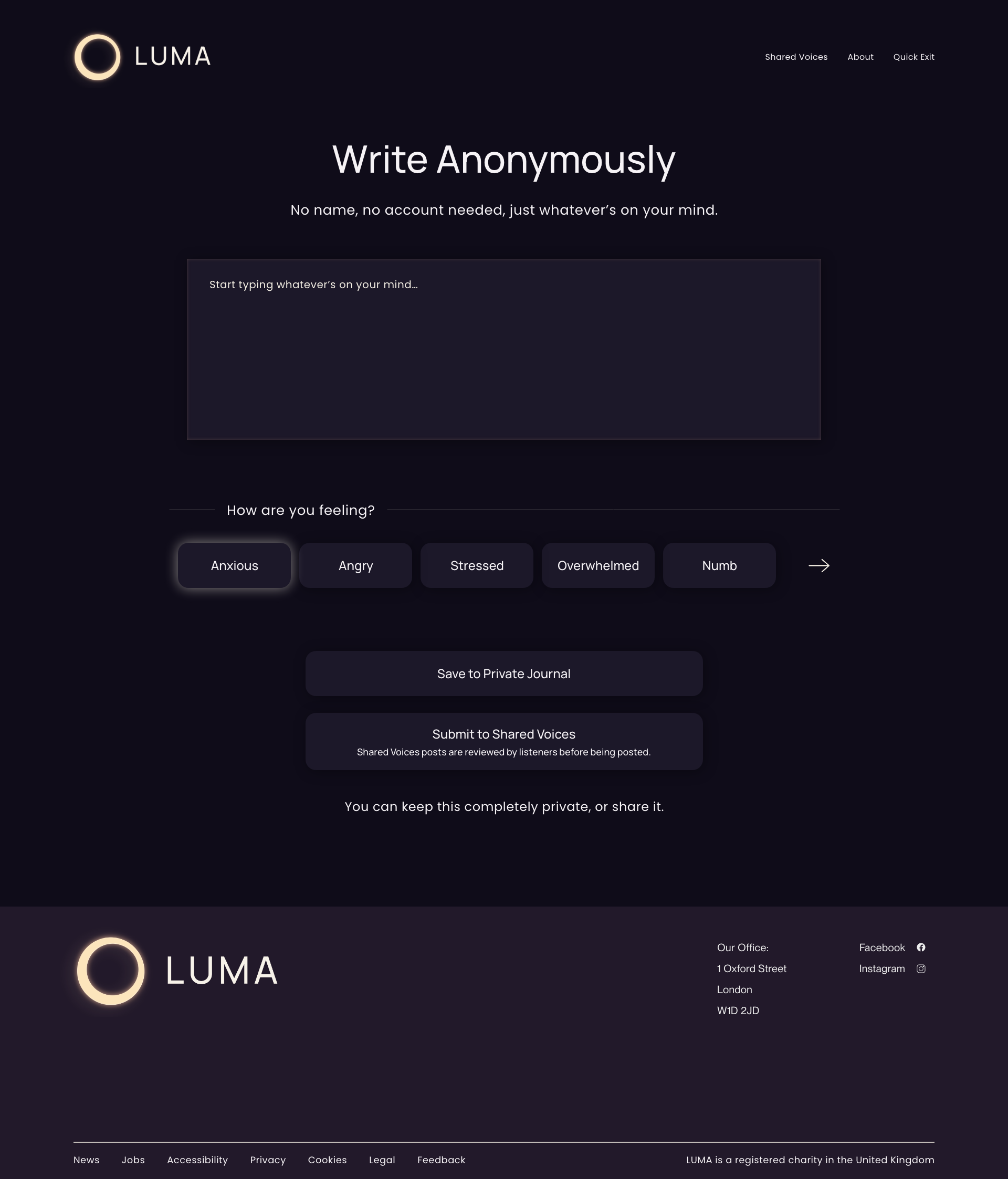
Instead of asking users to diagnose themselves, it meets them where they are - offering simple, human entry points that reduce pressure and friction.
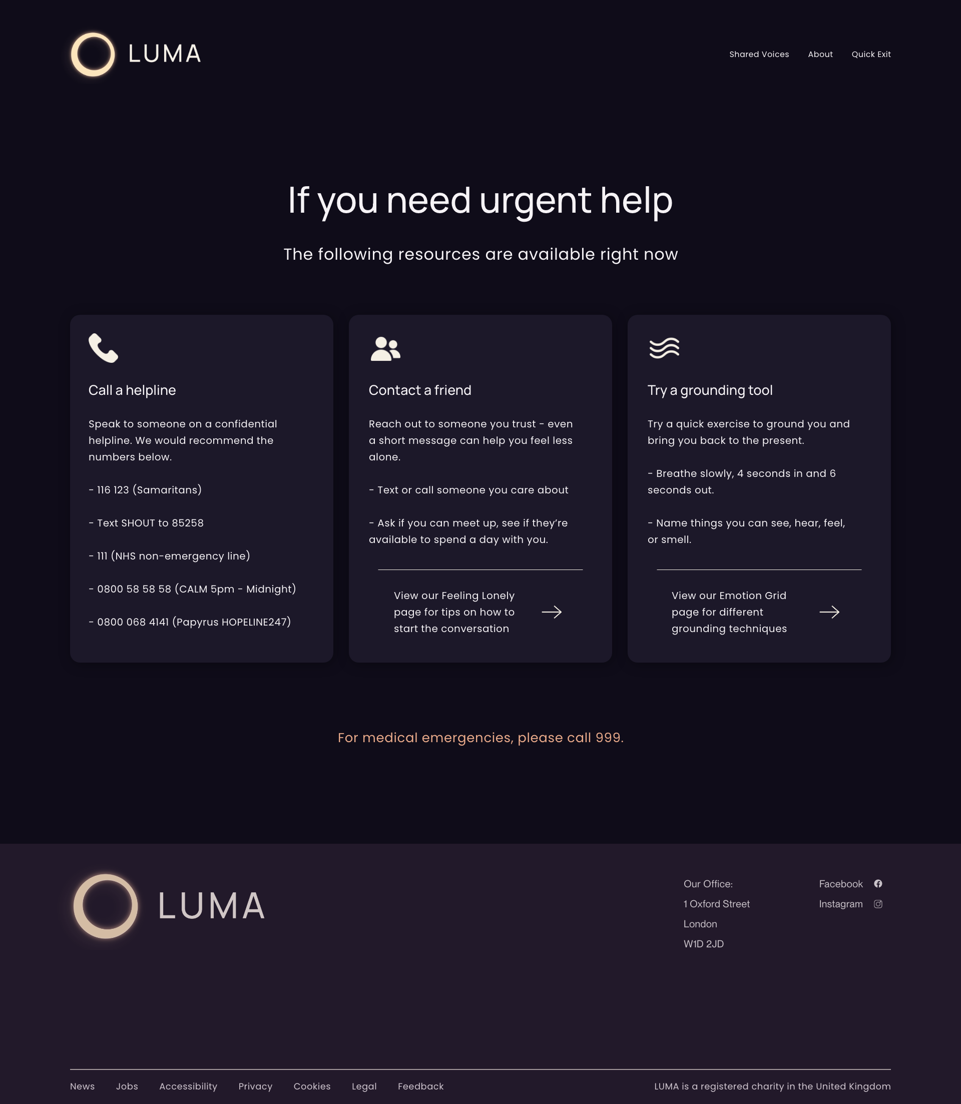
The experience is designed to feel immediate and supportive, rather than structured or overwhelming.
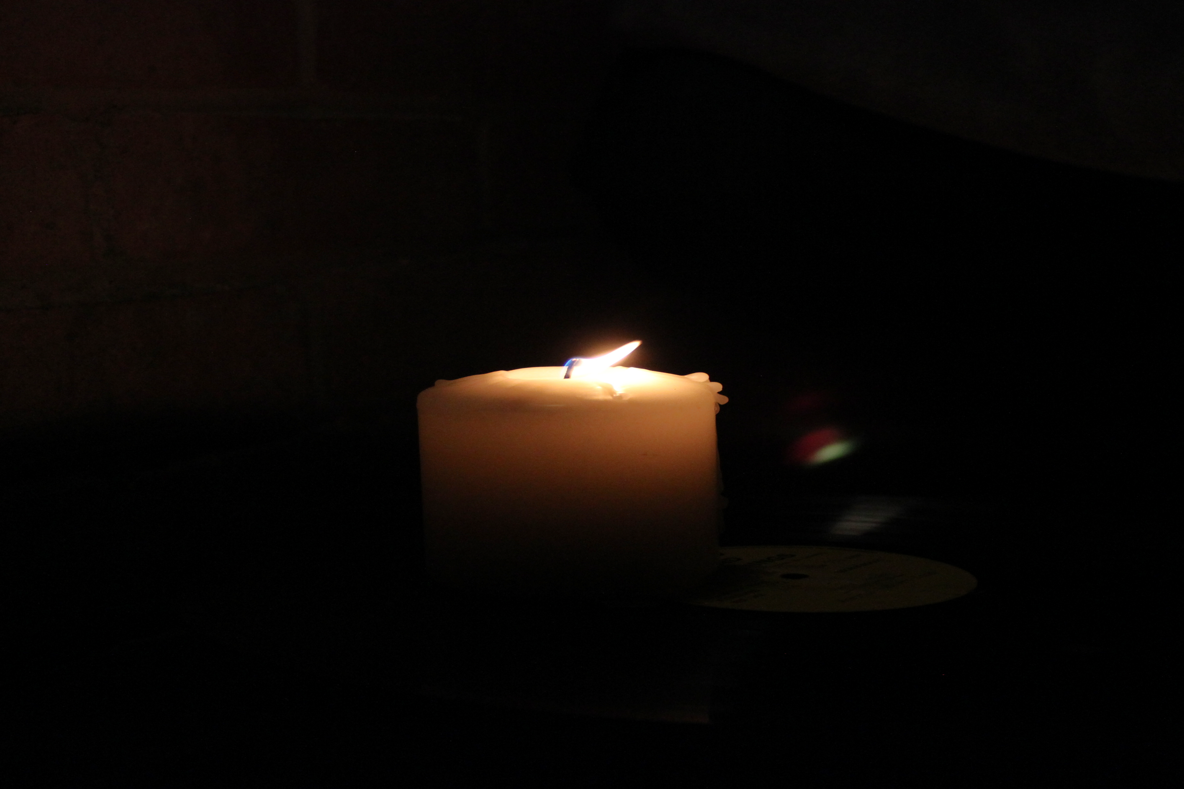
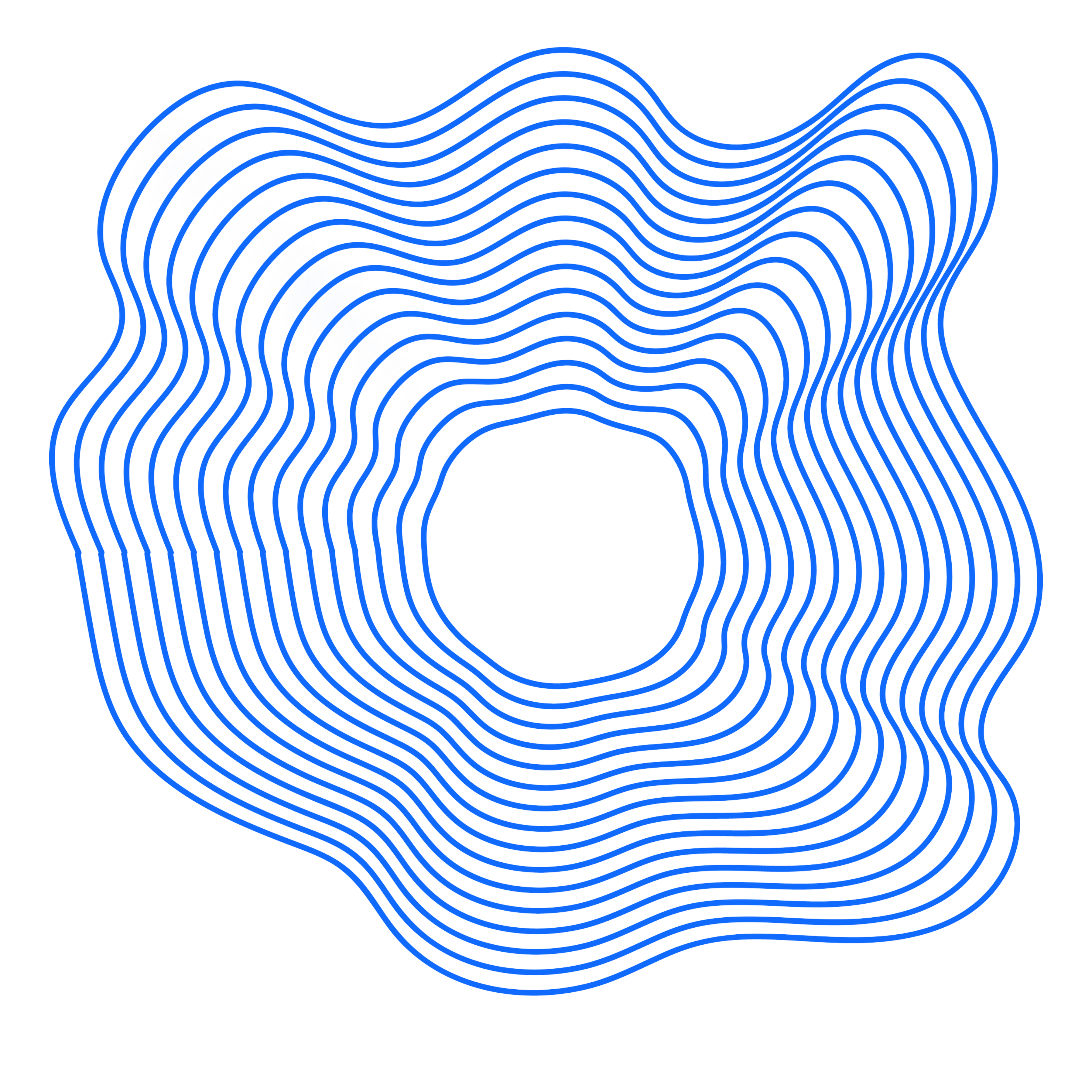
The identity centres around a soft glowing ring - a symbol of presence, support, and continuity.
A restrained palette and minimal typography create a calm, contemporary tone that avoids the clinical feel of traditional platforms.
The system is designed to reduce visual noise, allowing users to focus on how they feel rather than how the interface behaves.
LUMA delivers a more emotionally accessible alternative to traditional mental health platforms, prioritising clarity, safety, and low-pressure interaction.
By shifting from clinical structures to feeling-led pathways, the experience reduces friction and encourages engagement without overwhelming the user.
The project demonstrates how digital design can support emotional needs through restraint, clarity, and intentional interaction design.
Emotion-first language
Users begin based on how they feel, not predefined categories.
Visually calm interface
Soft glow, restrained dark colour palette, and minimal UI reduce overwhelm.
Low-pressure navigation
No forced decisions - multiple pathways at every stage.
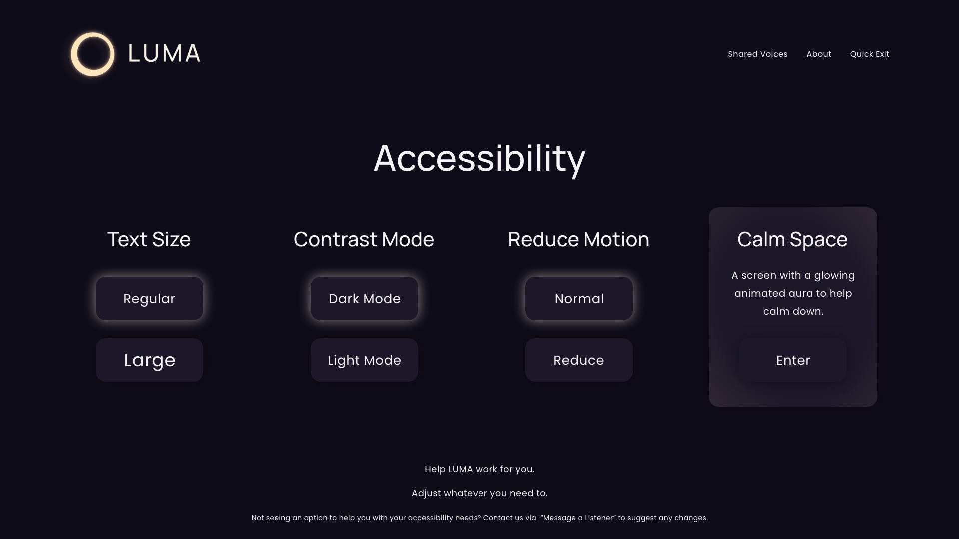
Accessibility built-in
Clear hierarchy, readable contrast, and an adjustable accessibility menu.


Manrope
abcdefghijklmnopqrstuvwxyzABCDEFGHIJKLMNOPQRSTUVWXYZ0123456789!@£$%^&*()
abcdefghijklmnopqrstuvwxyzABCDEFGHIJKLMNOPQRSTUVWXYZ0123456789!@£$%^&*()
Poppins
Designing for emotional clarity, not complexity
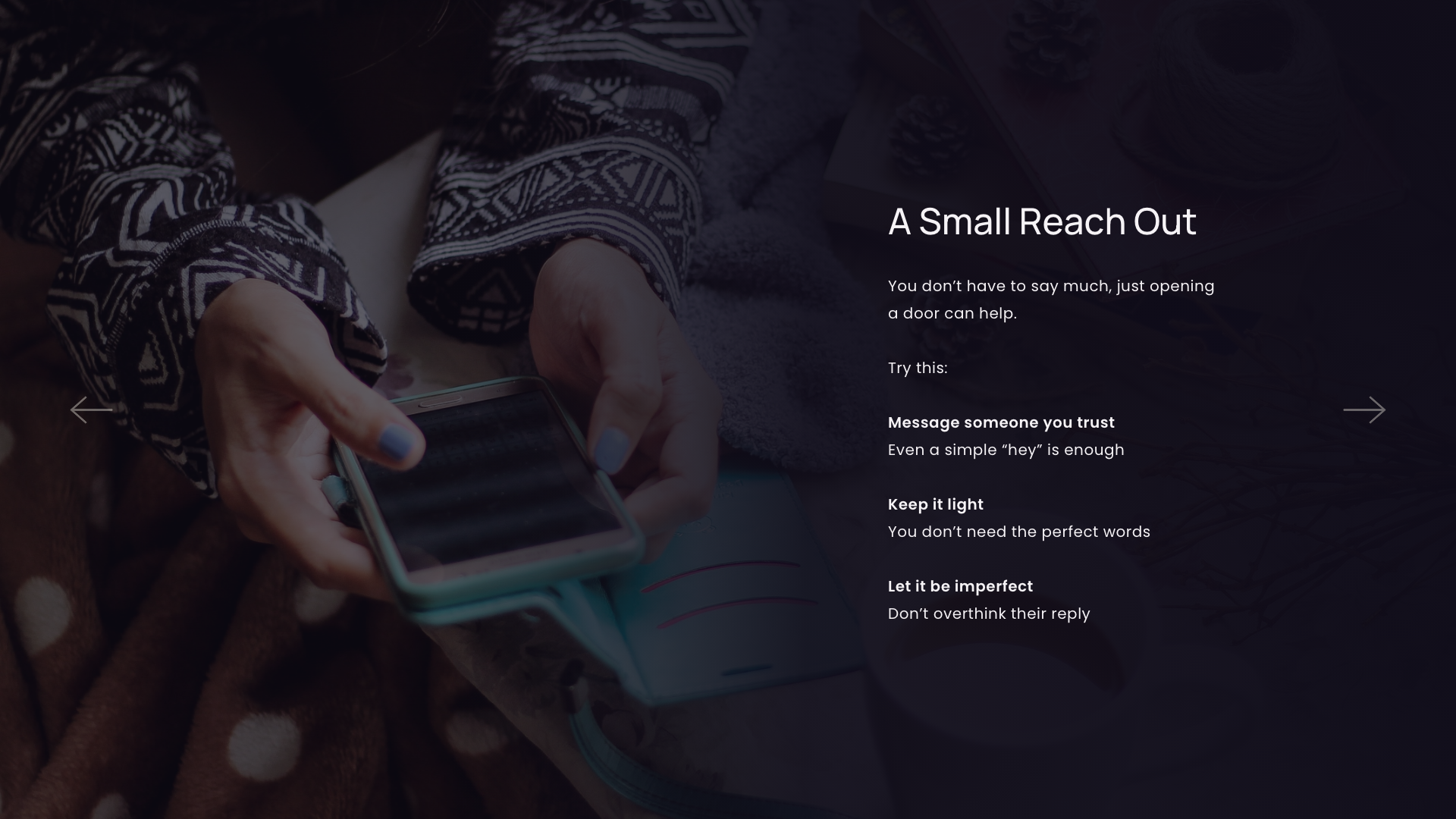
Key moments across the experience focus on reducing pressure, offering clear pathways, and supporting users at different levels of need.
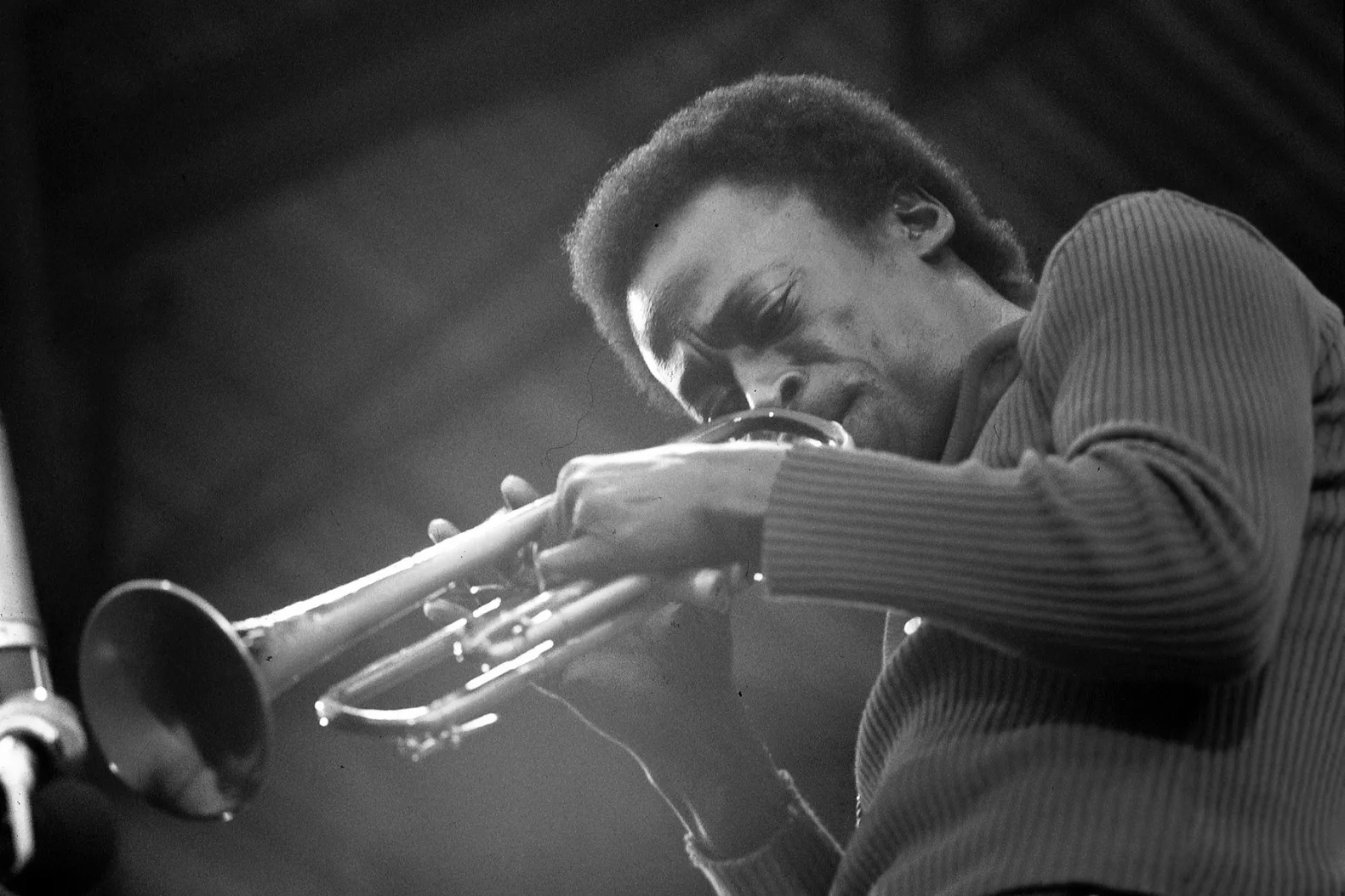
Miles Davis
Visual system design - Concept
2024 | Visual System | Music Design
No Disguise
Youth mental health platform - Concept
2026 | Brand Identity | Website Design | UI/UX
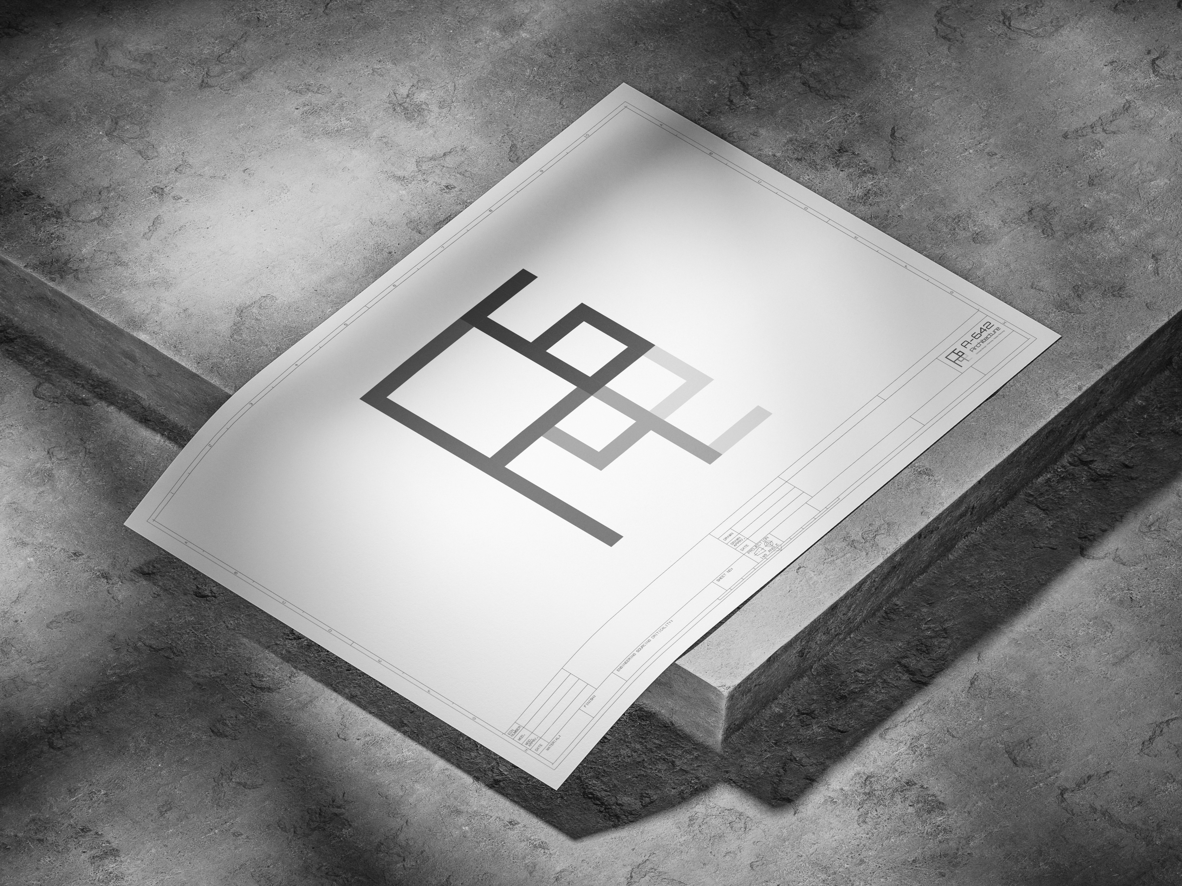
A-642 Architects
Branding commissioned by A-642
2025 | Branding | Client Project


2026 | Brand Identity | Website Design | UI/UX
LUMA
Youth mental health platform - Concept
PROJECT
Mental health support for young people often feels clinical, distant, or inaccessible.
Existing platforms prioritise structure over emotional connection, making it difficult for users to engage in moments of vulnerability.
LUMA was designed to create a more immediate, human entry point into support - removing friction, reducing intimidation, and focusing on how people feel first.
Designed for how people feel, not what they click
A calm, recognisable visual language
Outcome
Built around clarity, safety, and accessibility
LUMA shifts away from clinical, task-based systems toward emotion-led interaction.
Instead of asking users to diagnose themselves, it meets them where they are - offering simple, human entry points that reduce pressure and friction.
The experience is designed to feel immediate and supportive, rather than structured or overwhelming.
The identity centres around a soft glowing ring - a symbol of presence, support, and continuity.
A restrained palette and minimal typography create a calm, contemporary tone that avoids the clinical feel of traditional platforms.
The system is designed to reduce visual noise, allowing users to focus on how they feel rather than how the interface behaves.
LUMA delivers a more emotionally accessible alternative to traditional mental health platforms, prioritising clarity, safety, and low-pressure interaction.
By shifting from clinical structures to feeling-led pathways, the experience reduces friction and encourages engagement without overwhelming the user.
The project demonstrates how digital design can support emotional needs through restraint, clarity, and intentional interaction design.
Emotion-first language
Users begin based on how they feel, not predefined categories.
Visually calm interface
Soft glow, restrained dark colour palette, and minimal UI reduce overwhelm.
Low-pressure navigation
No forced decisions - multiple pathways at every stage.
Accessibility built-in
Clear hierarchy, readable contrast, and an adjustable accessibility menu.


Manrope
abcdefghijklmnopqrstuvwxyzABCDEFGHIJKLMNOPQRSTUVWXYZ0123456789!@£$%^&*()
abcdefghijklmnopqrstuvwxyzABCDEFGHIJKLMNOPQRSTUVWXYZ0123456789!@£$%^&*()
Poppins
Designing for emotional clarity, not complexity
Key moments across the experience focus on reducing pressure, offering clear pathways, and supporting users at different levels of need.
Miles Davis
Visual system design - Concept
2024 | Visual System | Music Design
No Disguise
Youth mental health platform - Concept
2026 | Brand Identity | Website Design | UI/UX
A-642 Architects
Branding commissioned by A-642
2025 | Branding | Client Project

