


Response to ISTD Power brief
2026 | Editorial | Bookbinding
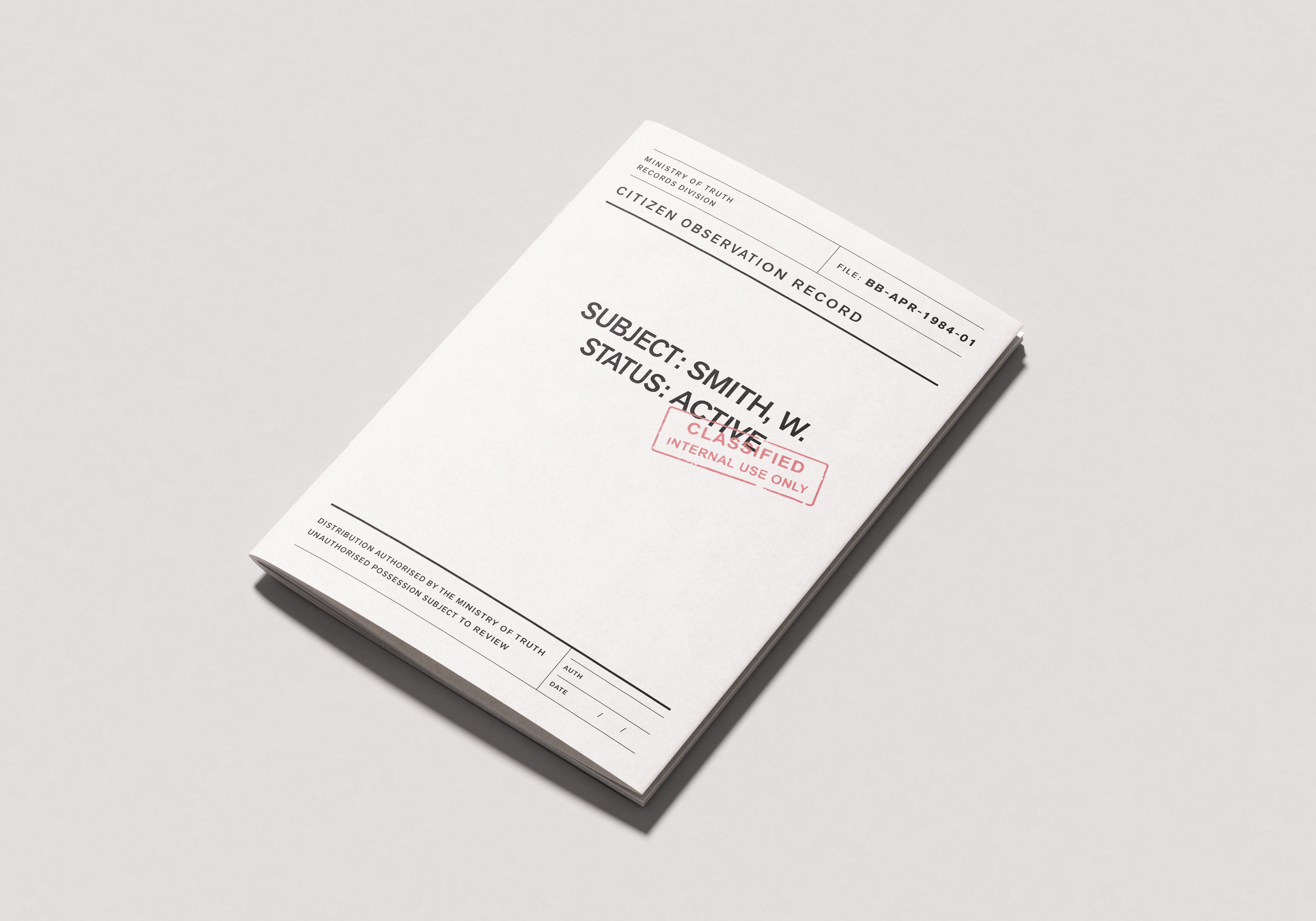
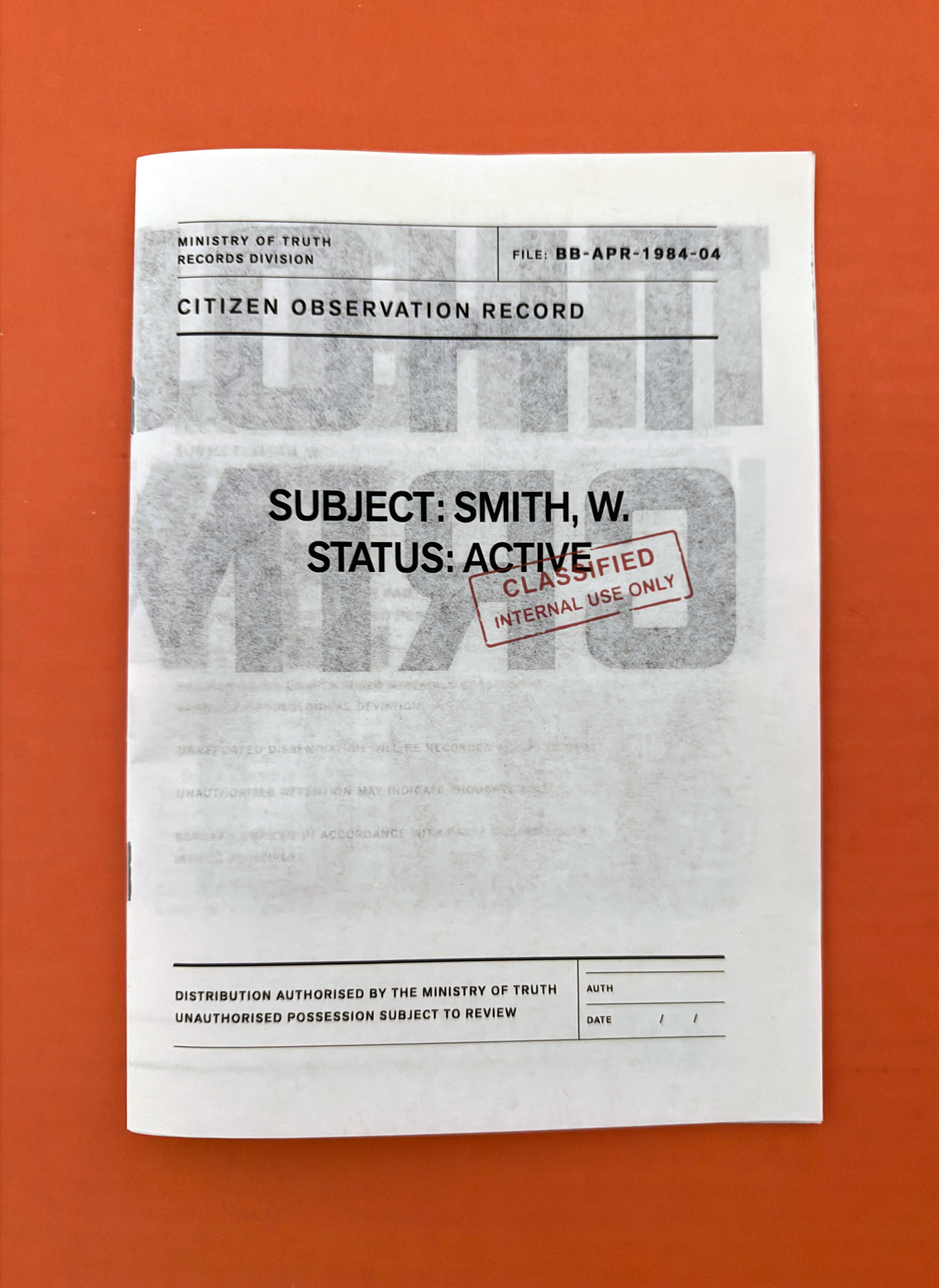
1984 - Typographic System
PROJECT
A typographic response to George Orwell’s 1984, exploring surveillance, control, and authority through structure rather than imagery.
The project translates the language of propaganda and bureaucracy into a rigid visual system, using scale, repetition, and hierarchy to shape how content is read and controlled.


Miles Davis
Visual system design - Concept
2024 | Visual System | Music Design

No Disguise
Youth mental health platform - Concept
2026 | Brand Identity | Website Design | UI/UX


LUMA
Youth mental health platform - Concept
2026 | Brand Identity | Website Design | UI/UX
Scale, repetition, and hierarchy position the reader within a system of control. Typography operates as a mechanism of authority rather than expression.

Large-scale typography interrupts and dictates the reading experience
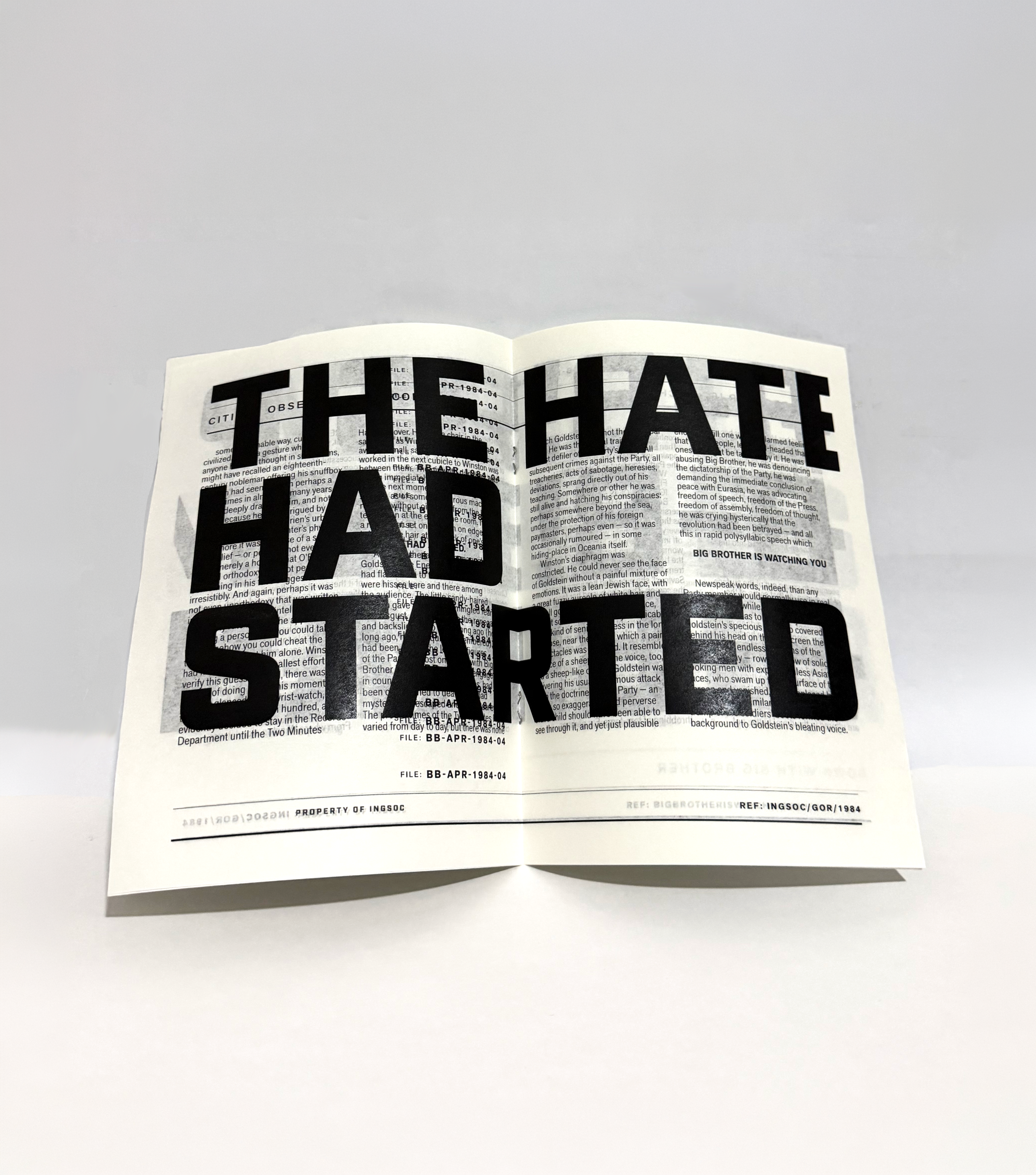
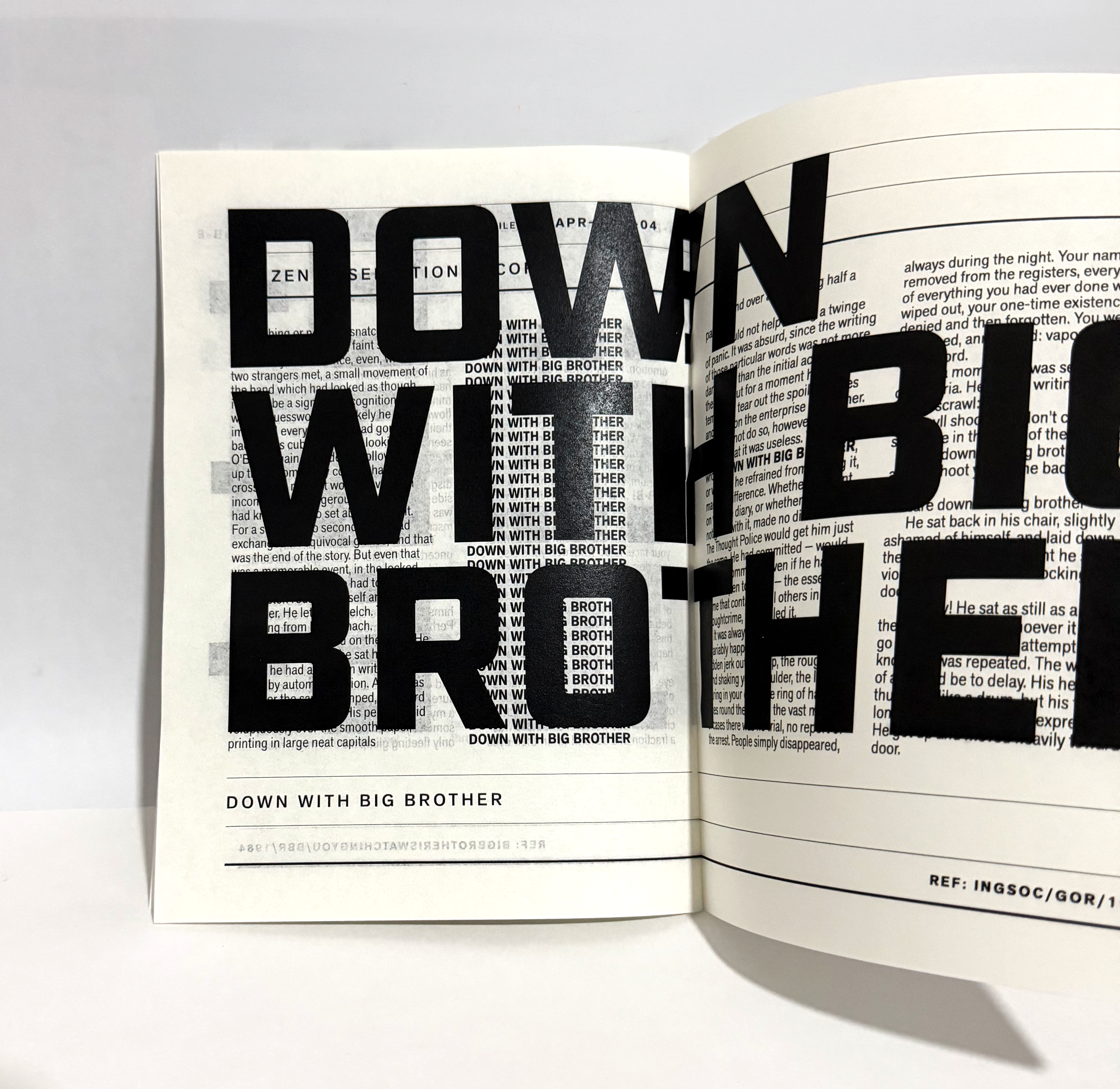
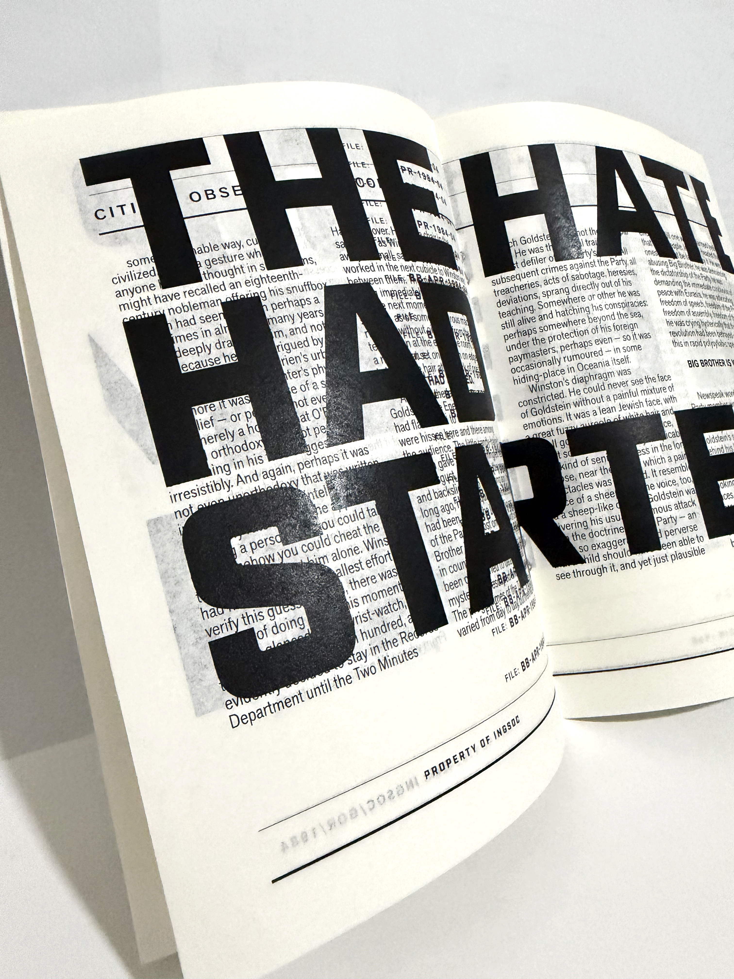
Headlines interrupt reading through scale and density, while body text remains constrained within a strict column structure. Variation is limited, reinforcing consistency and control across all spreads.


A fixed grid and typographic hierarchy governs every composition
6 COLUMN GRID
12PT BASELINE GRID
15MM MARGINS
CONSISTENT ALIGNMENT
CONTROLLED SCALE
Printed on 45gsm uncoated stock (bank paper) allowing content to remain visible across pages. Transparency suggests that information cannot be hidden, only layered.
Material choices reinforce concept of surveillance
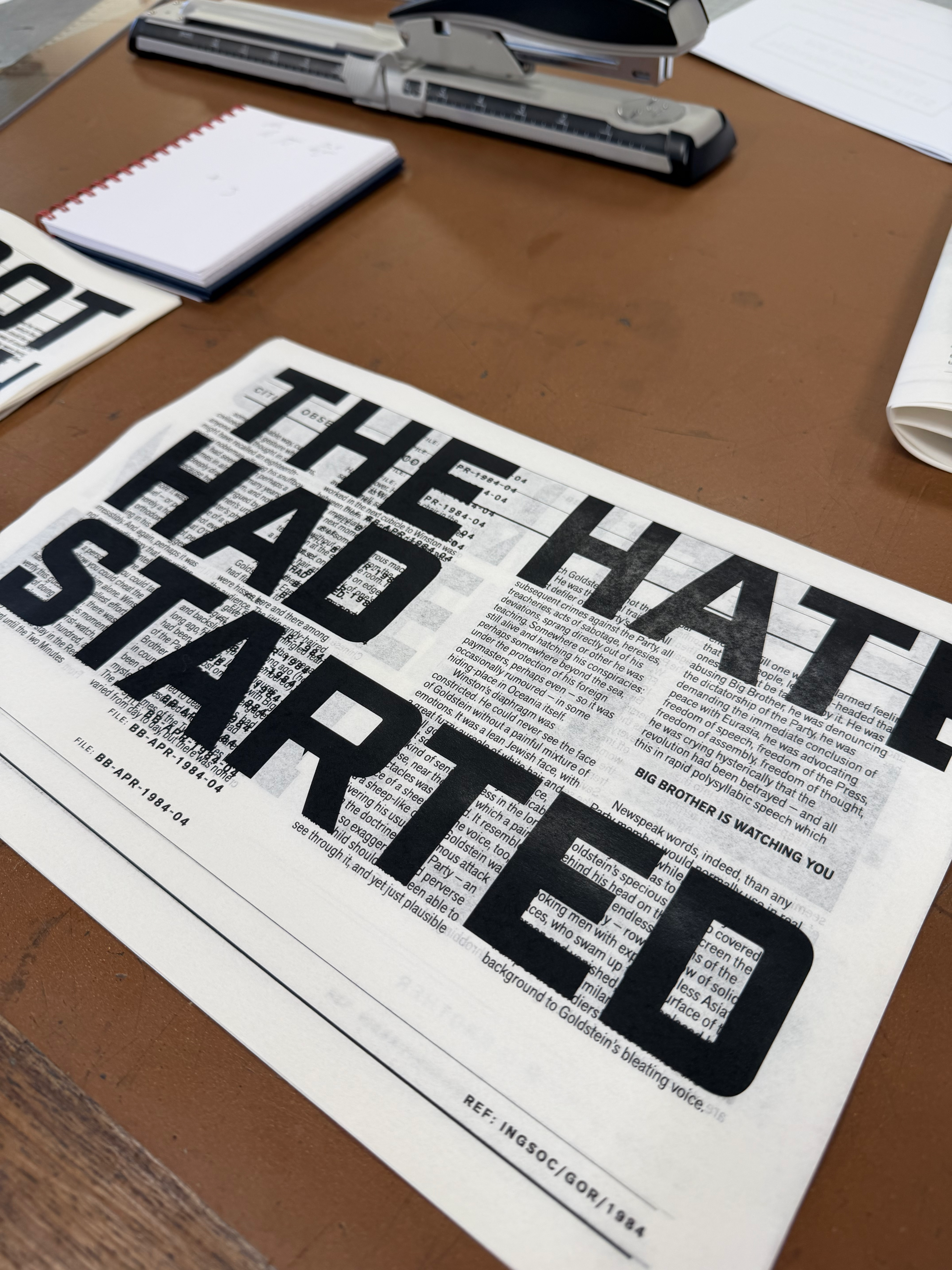
Content is never fully contained. Overlapping text and ink density reinforce the feeling of constant observation and recorded behaviour.
Close-up views reveal the layering of information
Outcome

The final outcome is a printed publication that translates the language of surveillance into a controlled typographic system.
Through scale, hierarchy, and material choice, the work positions typography as an active force - interrupting, obscuring, and regulating the reading experience. The use of lightweight paper allows information to remain partially visible across pages, reinforcing the idea that content is never fully hidden, only layered and monitored.


Response to ISTD Power brief
2026 | Editorial | Bookbinding
1984 - Typographic System
PROJECT
A typographic response to George Orwell’s 1984, exploring surveillance, control, and authority through structure rather than imagery.
The project translates the language of propaganda and bureaucracy into a rigid visual system, using scale, repetition, and hierarchy to shape how content is read and controlled.
Miles Davis
Visual system design - Concept
2024 | Visual System | Music Design
No Disguise
Youth mental health platform - Concept
2026 | Brand Identity | Website Design | UI/UX


LUMA
Youth mental health platform - Concept
2026 | Brand Identity | Website Design | UI/UX
Scale, repetition, and hierarchy position the reader within a system of control. Typography operates as a mechanism of authority rather than expression.

Large-scale typography interrupts and dictates the reading experience
Headlines interrupt reading through scale and density, while body text remains constrained within a strict column structure. Variation is limited, reinforcing consistency and control across all spreads.


A fixed grid and typographic hierarchy governs every composition
6 COLUMN GRID
12PT BASELINE GRID
15MM MARGINS
CONSISTENT ALIGNMENT
CONTROLLED SCALE
Printed on 45gsm uncoated stock (bank paper) allowing content to remain visible across pages. Transparency suggests that information cannot be hidden, only layered.
Material choices reinforce concept of surveillance
Content is never fully contained. Overlapping text and ink density reinforce the feeling of constant observation and recorded behaviour.
Close-up views reveal the layering of information
Outcome

The final outcome is a printed publication that translates the language of surveillance into a controlled typographic system.
Through scale, hierarchy, and material choice, the work positions typography as an active force - interrupting, obscuring, and regulating the reading experience. The use of lightweight paper allows information to remain partially visible across pages, reinforcing the idea that content is never fully hidden, only layered and monitored.
